

A conceptual beauty editorial exploring how print, adornment, and portrait composition turn color into presence.
Some beauty images rely on expression. Others rely on styling. The strongest portraits know how to use both — but they always begin with composition.
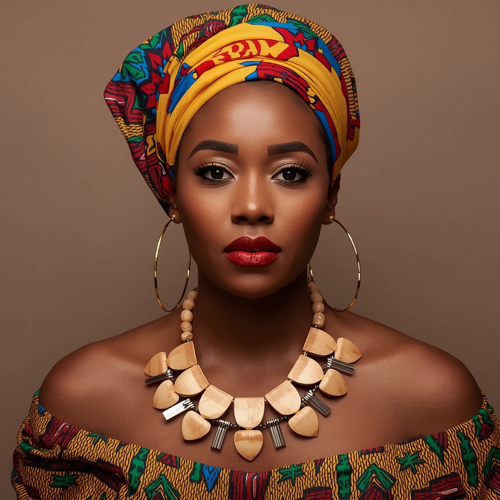
Across these four UZURI Studio portraits, a single visual argument emerges with increasing clarity: color, when handled with discipline, is not decoration. It is structured. The wrapped headpiece in each frame — vivid with yellow, red, blue, and geometric print — does not merely cover the head. It builds the silhouette. It gives the face context, a frame, a reason to hold the eye exactly where the image needs it. Remove the wrap, and you have a portrait. Keep it, and you have a statement.

What unifies the series is its restraint beneath all that vibrancy. Each background is stripped back — warm taupe in some frames, cool grey in others — precisely so the color can do its work without competition. The off-shoulder design in all four portraits anchors the composition below the facial features, guiding the viewer’s gaze in a clear vertical trajectory from the crown of the wrap, through the eyes, past the collarbone, and culminating at the necklace. This line constitutes the series’ fundamental editorial structure.
The necklaces warrant distinct consideration. Each portrait depicts a unique iteration of a consistent material dialogue: wood, bone, metal, and bead, arranged with the sensibility of a sculptor rather than that of a jeweler. In the initial portrait, broad shield-shaped wooden pieces extend across the chest, resembling armor crafted in warm grain. The second strips the silhouette back slightly, letting fringe-cut pendants carry more negative space and breath. The third introduces chunky disc beads with raw silver charms — earthy and geometric simultaneously. The fourth builds a cascading fan of wood-and-metal rectangles that catches light with an almost architectural confidence. Together, the four pieces form a kind of material thesis: that statement jewelry is at its most powerful when it echoes the geometry above it.

The makeup across the series is precise and consistent in its logic — deep red lips, sculpted brows, editorial eye definition that sharpens without overwhelming — and this consistency is not accidental. It signals that these are not four separate looks. There are four movements in a single visual composition, each one building on the last.
What UZURI Studio finds most compelling in a series like this is the discipline it takes to make vibrancy feel intelligent. Anyone can place bold color in a frame. It takes considerably more editorial control to make that color compose an image — to make it frame a face, anchor a mood, and turn a portrait sitting into something that reads less like a photo shoot and more like a fully formed visual argument.
These four portraits do exactly that. They are not simply colorful. They are composed. And in beauty editorial, that is the only distinction that matters.